Signage and Surface Markings
Delaware & Lehigh Trail | Photo by Thom Carroll
Installing signage and surface markings along a trail can help ensure the safety of trail users. Signs are also helpful in pointing out trail features and landmarks to make the experience more enjoyable to users. Signage and surface markings should be clear, concise and consistent. They should be easily read by all trail users.
One of the best resources for signage and surface marking guidelines is the Manual on Uniform Traffic Control Devices (MUTCD) produced by the Federal Highway Administration (FHWA). The comprehensive guide lists federal rules, regulations and recommendations for the construction and placement of safety signs and markings that trail builders should follow. Guidelines relating to bicycle facilities can be found in Part 9 of the MUTCD.
Another important resource is the American Association of State Highway and Transportation Officials’ Guide for the Development of Bicycle Facilities (AASHTO Bike Guide). Section 5.4 details sign and surface marking recommendations.
Along the Trail
Regulatory and Warning Signs
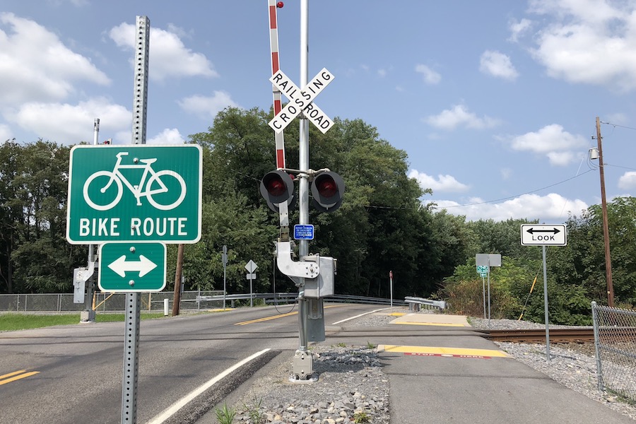
Regulatory and warning signs should be placed throughout the trail in appropriate locations (i.e. crossings, areas with limited visibility, cliffs, etc.) and comply with MUTCD standards. Since excessive signage may cause trail users to feel restricted or overwhelmed with information, warning signs should be placed only where necessary. Locations for the signs should be identified in engineering studies and during the trail design phase.
Regulatory signs, such as Stop, Yield, and Do Not Enter signs, should conform to the standard shape and color schemes as used on roads, but they can and should usually be smaller than signs intended for roads. Warning signs should be either yellow or fluorescent yellow-green and diamond-shaped, but temporary construction warning signs may be orange. Sign companies should be familiar with MUTCD standards.
Tips on warning sign use and placement can be found in Chapter 2C of the MUTCD, although much of this information is specific to roads and highways. Remember to scale signage appropriately for typical trail users. Refer to the AASHTO Bike Guide for additional guidance specific to bicycle facilities.
Size: The MUTCD regulates sign proportions to maximize safety, visibility and consistency. If the standard size of regulatory and warning signs is not appropriate for the trail, the signs can be scaled in intervals of six inches.
Placement: Signs should be placed 3 feet off the trail and 4-5 feet off the ground for optimal visibility. They should be placed in an area unobstructed by vegetation, fences and other obstacles.
Text: On regulatory and warning signs, sign text should be 3-6 inches tall for optimal viewing.
Retroreflectivity: Regulatory and warning signs should meet MUTCD standards of retroreflectivity. Signs come in different grades of retroreflectivity, and higher grades should be used in darker or more hazardous areas.
Wayfinding Signs
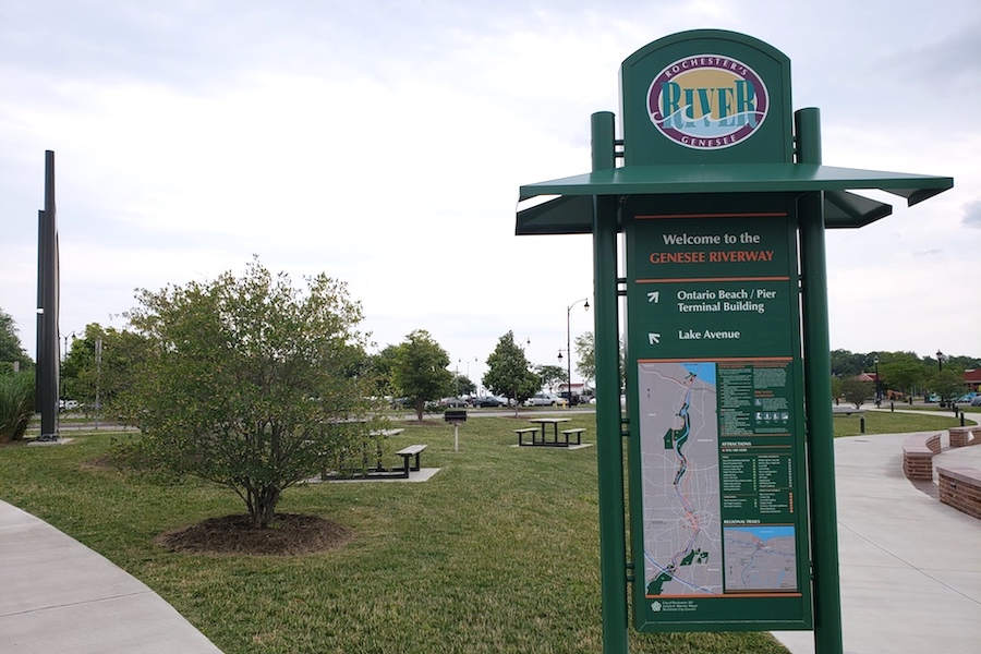
Wayfinding signs can help trail users stay safely on track and find their way. While they are often not needed on simple trails, wayfinding signs can be very helpful in complex trail networks, remote locations and areas where the trail may be obscured by vegetation. These signs can be as simple as arrows pointing in the direction of the trail or can include more detailed information such as mileage to other trails, towns or attractions. Signs pointing trail users to restrooms, snack bars, local businesses or campgrounds are also helpful.
Mile Markers
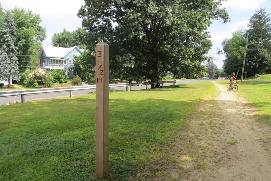
Mile markers placed incrementally along a trail can significantly enhance the trail experience. Those using the trail for exercise often appreciate the presence of mile markers, as they can more easily track their distance traveled. Frequent, accurate markers also help to determine location in case of an accident or other emergency. When markers are installed, their locations can be recorded with a GPS device and incorporated into a town or city’s GIS. Mile markers may be embedded into the pavement or displayed on posts, but the higher visibility and longevity of posts generally makes determining location easier, especially years after they have been installed.
Traditionally, railroads used single mile markers, but many trail managers choose to mark locations with more precision, such as every quarter mile. Larger trail networks may benefit from having a color-coded scheme when trails branch off from one another. The expanding trail system of Louisville, Kentucky, provides an excellent example of effective mile marker use.
Trailheads
Interpretive Signs
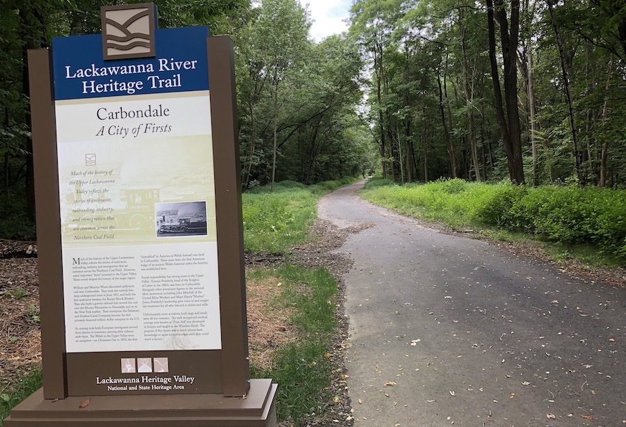
At trailheads, an interpretive sign to greet users and introduce them to the trail is often a welcome addition. Some interpretive sign features could include:
- A trail map;
- Rules and regulations—but try to use a positive tone and focus on what users can enjoy;
- Warnings about poisonous plants, wild animals, dangerous weather conditions or other hazards;
- A community bulletin board to inform trail users of major events happening on the trail;
- Information about the trail’s ecology and environment, with tips to minimize environmental impacts;
- Historical information—the rail-trail may have a rich history that adds to the user experience;
- A directory of attractions alongside or not far from the trail; and
- A point of contact for trail maintenance issues.
Interpretive signs can be artistically made, and creativity in design is generally appreciated. Interpretative signs don’t have to be restricted to the trailhead; they can also be displayed alongside the trail to provide historical and/or ecological information. The US Forest Service provides basic guidelines on this type of sign.
Donor Recognition
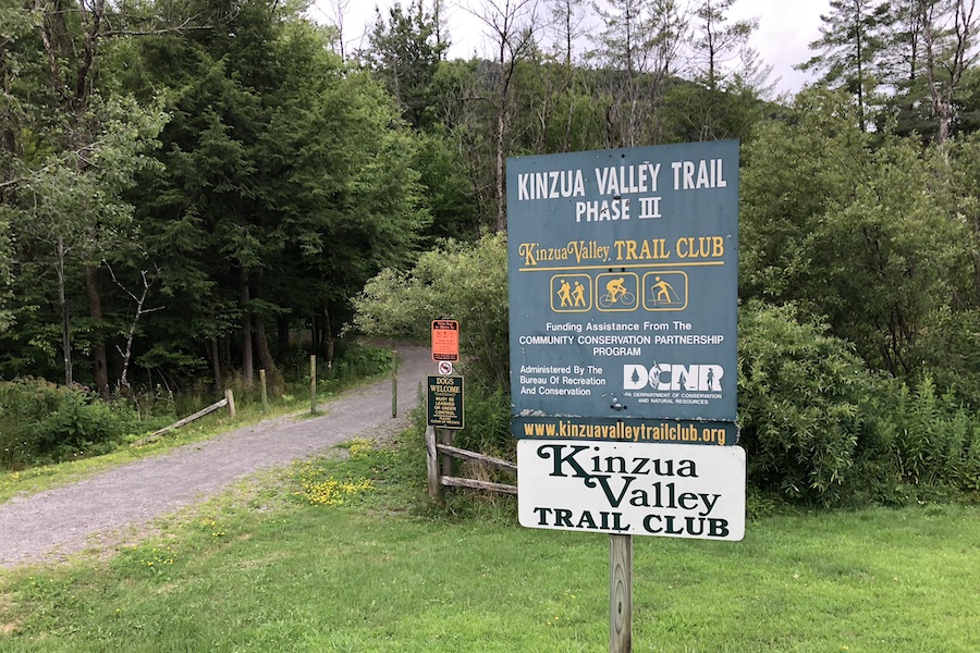
Recognition signs, plaques or artwork can thank donors for their contributions to the trail. Many creative options exist, such as a sculpture incorporating the donors’ names. The pieces of art or plaques can be featured at the trailhead or along the trail, and when done properly, can add to the aesthetic of the trail in a creative way.
Materials
Many material options for interpretative signs exist. Before deciding on the material, consider the desired aesthetic, budget and amount of expected damage from weather and vandalism. Some signs made of recycled plastic (high density polyethylene, digital high-pressure laminate, etc.) are more environmentally friendly, durable and resistant to vandalism and weather, which cuts down on maintenance and replacement costs. Signs should always avoid sharp corners and splintering material to prevent injury.
Materials for warning and regulatory signs are more restrictive due to the need to comply with MUTCD standards for retroreflectivity. Aluminum signs are most popular, and recycled aluminum signs are also available as a more sustainable option.
Cost and Sponsorship
Signage and surface markings are relatively cheap in the grand scheme of trail development. According to the City of San Jose, signage and striping costs for trails with a plethora of interpretive, warning and guidance signs can reach $30,000 per mile.
However, asking local businesses to sponsor a sign in return for a sign displaying the name of their business or a directional arrow along the trail can cut down on signage costs while benefiting the community by promoting local small businesses. Corporate sponsorship is another option, but trail managers would need to ensure excessive signage isn’t required that might disrupt the natural setting, vistas or user experience along the trail.
Surface Markings
Like signage, striping and other surface markings can make a paved trail safer by communicating rules and regulations to users. However, surface markings should not replace signage, as they are often less visible, especially in obscuring weather conditions. Surface markings, like regulatory and warning signs, should also follow retroreflectivity standards so they are visible at night.
Surface markings in the form of crosswalks should always be installed at trail intersections with roads. Refer to the Crossings section of the Trail-Building Toolbox for more information on crosswalks.
Striping
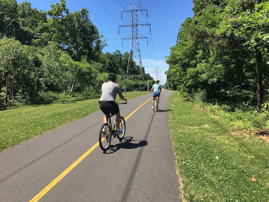
Centerline striping is not always necessary on low-traffic trails but adding it to higher-traffic trails can improve safety. Striping can also make trail users more aware of potentially dangerous areas along a trail: when a sharp curve or a blind driveway appears, a solid line and a warning sign could make the challenge more obvious and inform cyclists to exercise caution. Trails with high current or expected use by children—such as near a school—might also benefit from trail striping, as it can help them differentiate between the “left” and “right” side of the pathway.
Differentiated Bike Lanes
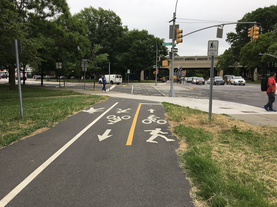
If a trail experiences a very high volume of both pedestrians and cyclists, consider separating the trail into pedestrian lanes and bike lanes. If there is adequate space, a bidirectional pedestrian lane at least 5 feet wide should run adjacent to two unidirectional bicycle lanes. If the trail offers a particularly appealing view on one side, pedestrians should generally be closest to that side to minimize the risk of collisions.
Maintenance
Striping and pavement markings require a good amount of maintenance, particularly in snowy areas where snowplows can damage the markings. One potential solution is to carve out the area and fill it with a thermoplastic so the surface is flatter. This process is expensive but should cut down on maintenance costs in the long run.
Network Signage and Branding
Trails that cross jurisdictional boundaries or that are part of a wider network may desire consistent signage or otherwise be subject to varied signage standards imposed by the agencies in charge of them. To counter the confusion caused by different standards, stakeholders in regional trail networks should collaborate to develop a cohesive family of signs covering the entire system. A unified design language improves the user experience not only by directing users, but by assuring them that they are on the right path and encouraging them to explore.
Consistent branding unifies the component trails and elevates their visibility as an integrated system. Good signage will increase the awareness of trails within a community, even outside of the system itself. In general, effective network signage should strike a balance between establishing a consistent look and feel, promoting the system and respecting the individual trails or the jurisdictions in which they are located.
In San Jose, California, a signage and wayfinding manual guides the application of signage across the city’s trails. Each trail is branded with a distinct icon and color combination at the trailhead while still clearly demonstrating its association with the larger network. During the development of the signage standards, the City of San Jose conducted an audit of the signs installed along existing trails, with the goal of using the list to inform the replacement of any signs that don’t conform with the new guidelines over time.
There are a variety of methods available to improve the branding and wayfinding of a trail network beyond the installation of traditional signage. Logos can be painted on bike lanes or the trail surface, and smaller signs or stickers can be added to existing streetscape elements like benches, bike racks, trash receptacles and street signs to catch the attention of passers-by and entice new users into the system. These efforts can complement the installation of dedicated network signage, or in some cases, make more expensive signage unnecessary. However, while the lower costs generally associated with these methods may make them attractive, the trail network’s branding may suffer from reduced visibility.
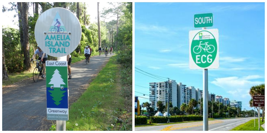
Trails that are part of the East Coast Greenway will often integrate the logo into their existing trail signposts. In other cases, the East Coast Greenway Alliance works with local municipalities to put up signs.
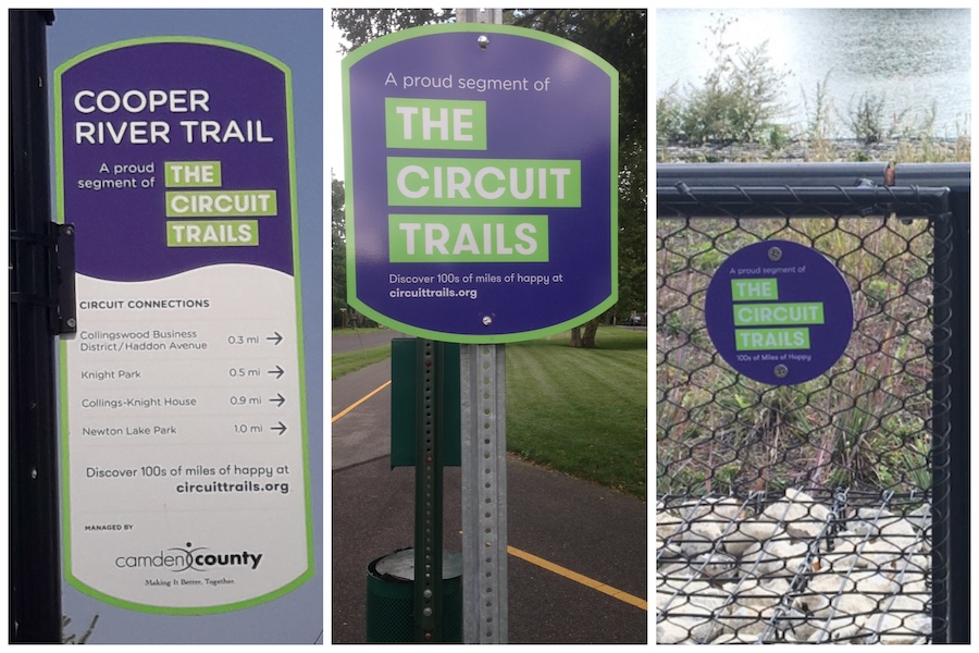
The Circuit Trails, a network of multiuse trails in the Greater Philadelphia region, have developed a recognizable brand whose elements—logos, color, typography and symbols—have been made available to trail managers and coalition partners to use. The Circuit also co-brands with local jurisdictions, including their logos in their signs. Circuit-branded directional signs are installed on trails and at trailheads. Where wayfinding signs already exist, affiliation signs are installed and circular medallions added to signposts, fences and mile markers to help assure users that they are within the network.
Resources
Manual on Uniform Traffic Control Devices (MUTCD): Manual by the Federal Highway Administration that regulates the standardization of signs and other traffic devices.
Retroreflectivity: A MUTCD standard for traffic signs and surface markings. Retroreflectivity results from reflected light returning in the opposite direction from which it came.
‣ Webinar – Trail Signage Networks: Creating a Unified Brand
‣ Manual – Trail Signage Guidelines: City of San Jose Trail Program
‣ Manual – The Intertwine Regional Trails Signage Guidelines
‣ Manual – City of San Jose Reflective Striping Specifications
‣ Manual – GAP Graphic Identity & Sign Design Guidelines
‣ Manual – Empire State Trail Design Guide
TrailNation Collaborative
TrailNation™ Collaborative is a nationwide peer learning community from Rails-to-Trails Conservancy that brings together advocates, leaders and professionals from across disciplines to establish and accelerate trail networks across America. The collaborative provides proven tools, methods and resources, combined with RTC’s expertise and network of partners across the country, to accelerate the development of connected trail systems. When trails are connected across regions and states, trail networks have a proven transformative impact—they are essential infrastructure that creates thriving, healthier communities.